12 Easy Ways to Choose a Bedroom Color Palette
Overwhelmed by Paint Chips? Start Here
Standing in the paint aisle with fifty shades of “greige” in hand is enough to make anyone give up entirely. Knowing how to choose a bedroom color palette doesn’t require a design degree, it requires a clear starting point and a few reliable methods that work in real rooms with real lighting. This guide breaks down twelve practical approaches, from foolproof formulas to mood-based strategies, so you can commit to a palette with confidence instead of repainting three times.
Why Color Confidence Is Trending in US Bedrooms
After years of safe, all-white interiors, American homeowners are embracing color again, but more thoughtfully than before. Instead of bold, trend-chasing choices, the current approach favors intentional palettes built around mood, light, and personal history. Paint brands report rising sales in warm neutrals, muted greens, and deep, saturated tones for bedrooms specifically, reflecting a broader desire for rooms that feel personal, restful, and considered rather than simply on-trend.
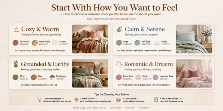
1. Start With How You Want to Feel
Before looking at a single swatch, decide on the emotional goal for the room. Calm and restful, cozy and enveloping, or bright and energizing are three very different directions that lead to very different palettes. Blues and greens tend to soothe, warm neutrals feel grounding, and deeper jewel tones create drama and intimacy. Naming the feeling first keeps you from getting distracted by trends that don’t actually suit your needs.
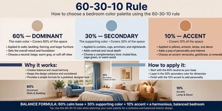
2. Use the 60-30-10 Rule
One of the most reliable formulas in design is the 60-30-10 color rule, sixty percent dominant color, thirty percent secondary, and ten percent accent. Typically, walls carry the dominant shade, bedding or furniture carries the secondary tone, and accessories like pillows or art carry the accent pop. This formula prevents a room from feeling flat or chaotic, since it builds in automatic balance without requiring an expert eye.
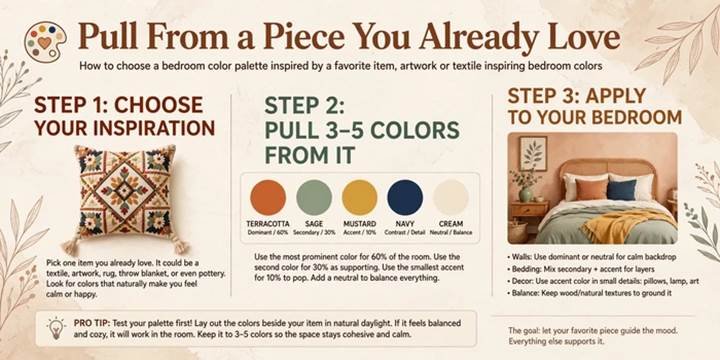
3. Pull From a Piece You Already Love
If you already own a rug, painting, or quilt you adore, let it anchor your entire palette. Pulling three or four colors directly from a beloved piece removes the guesswork of starting from scratch and guarantees the finished room feels cohesive. This approach to choosing a bedroom color palette also tends to produce spaces that feel personal rather than assembled from a generic template, since it’s rooted in something meaningful.
To read more trending bedroom ideas.
4. Test Paint in Actual Lighting
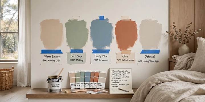
A color that looks perfect on a screen or in the store can shift dramatically under your bedroom’s specific light. Paint large swatches directly on the wall and observe them at different times of day, morning light, midday, and evening lamp light all change how a color reads. North facing rooms tend to cast cooler, grayer light, while south-facing rooms warm colors up. Skipping this step is the most common cause of paint regret.
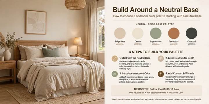
5. Build Around a Neutral Base
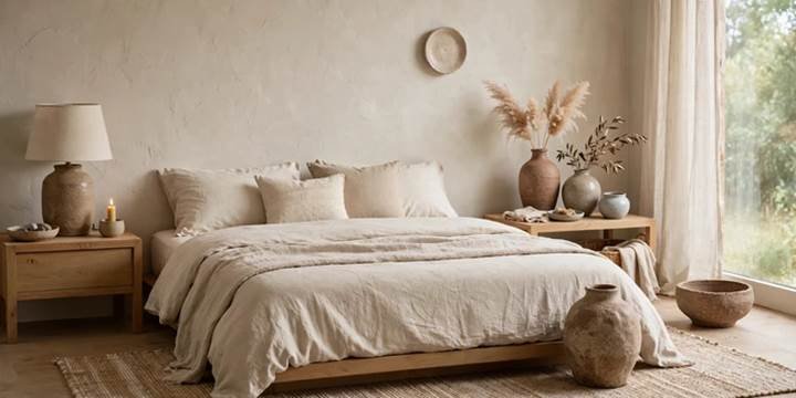
A neutral foundation, whether warm greige, soft white, or pale taupe, gives you flexibility to change accent colors over time without repainting. This approach works especially well for renters or anyone who likes to refresh their space seasonally through bedding and textiles. Layer in warmth through wood tones and texture so the neutral base never feels sterile, then rotate bolder colors through pillows, art, and throws as your mood shifts.
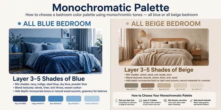
6. Try a Monochromatic Palette
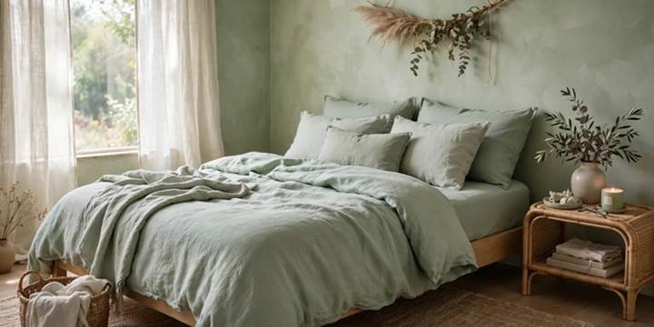
Choosing multiple shades of a single color, like three tones of blue or green, creates a monochromatic palette that feels sophisticated and impossible to get wrong. Vary the values from light to dark across walls, bedding, and accessories to build depth without visual noise. This approach is particularly forgiving for color-shy decorators, since everything within one color family is guaranteed to coordinate seamlessly.
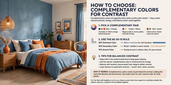
7. Use Complementary Colors for Contrast
For a bolder result, pair colors from opposite sides of the color wheel, like terracotta and sage green, or navy and mustard. This complementary color scheme creates energy and visual interest without clashing, as long as one color takes the lead and the other plays a supporting role. Keep the ratio closer to eighty-twenty rather than fifty-fifty to avoid a room that feels visually competitive or restless.
8. Consider the Room’s Natural Light
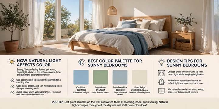
Rooms with limited natural light generally handle warm, saturated colors better than cool, pale ones, which can read as flat or gray without enough sunlight. Conversely, bright, sun-drenched rooms can handle cooler tones or even deep, moody colors without feeling cave like. Before committing to a palette, track how much direct light your room receives throughout the day, since this single factor changes how dramatically a color performs.
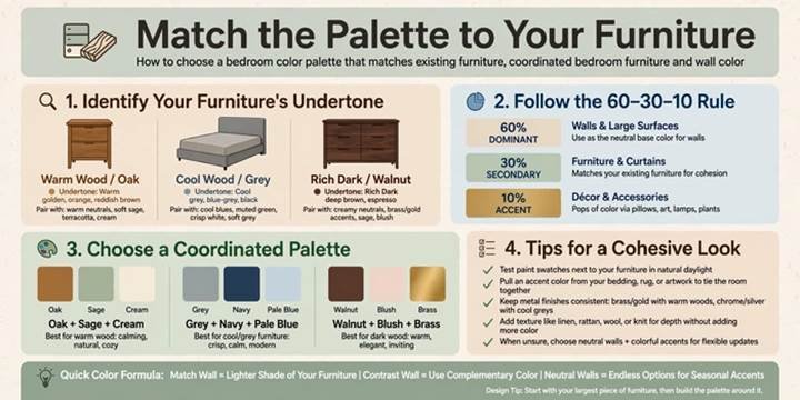
9. Match the Palette to Your Furniture
If you’re keeping existing furniture rather than replacing it, build your color palette around those fixed pieces instead of fighting against them. Warm wood tones pair beautifully with terracotta, olive, and cream, while cooler gray toned furniture leans naturally toward blues, lavenders, and crisp whites. This strategy for selecting a bedroom color scheme saves money and avoids the mismatched feeling that comes from ignoring what’s already in the room.
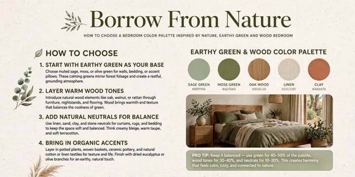
10. Borrow From Nature
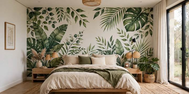
Color palettes inspired directly by nature, think sandy beach tones, forest greens, or dusky sunset hues, tend to feel instantly calming and cohesive because they already exist in harmony outdoors. Look to a favorite landscape photo or a walk outside for genuine inspiration rather than a generic trend report. This approach also tends to age well, since nature based palettes rarely feel dated the way trend-driven colors sometimes do.
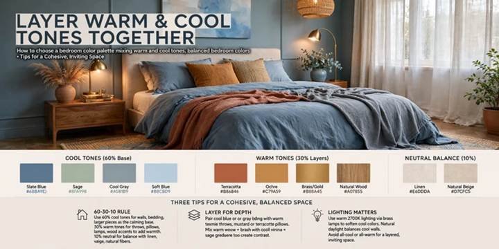
11. Layer Warm and Cool Tones Together
A palette that mixes both warm and cool elements, like a cool blue-gray wall paired with warm wood furniture and brass fixtures, tends to feel more dynamic and less flat than an all-warm or all-cool room. The contrast keeps the eye interested without requiring bold color choices. This balanced approach works well for anyone who wants a sophisticated, layered look without committing to a dramatic or trend-heavy palette.
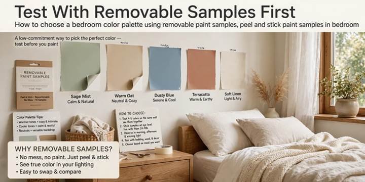
12. Test With Removable Samples First
Before painting an entire wall, use large peel and stick paint samples or poster sized swatches to preview a color across different areas of the room. This method for choosing a bedroom color palette lets you compare two or three finalists side by side in real lighting conditions without the commitment or mess of actual paint. It’s especially useful for renters or anyone hesitant to commit to a full gallon before feeling certain.
Color Palette Approach Comparison Table
| Idea | Best For | Style/Room Type |
| Start With a Feeling | First-time decorators | Any bedroom |
| 60-30-10 Rule | Balanced, foolproof results | Any bedroom |
| Pull From a Loved Piece | Personal, meaningful spaces | Any bedroom |
| Test Paint in Real Light | Avoiding paint regret | Any bedroom |
| Neutral Base | Renters, frequent refreshers | Any bedroom |
| Monochromatic Palette | Color-shy decorators | Any bedroom |
| Complementary Colors | Bold, energetic spaces | Primary bedroom |
| Match Natural Light | Rooms with light challenges | Any bedroom |
| Match Existing Furniture | Budget-conscious updates | Any bedroom |
| Nature-Inspired Palette | Calming, timeless looks | Any bedroom |
| Warm and Cool Layering | Sophisticated, dynamic rooms | Primary bedroom |
| Removable Sample Testing | Renters, cautious decorators | Any bedroom |
Frequently Asked Questions
What is the best color palette for a small bedroom?
Light, cohesive palettes generally work best for small bedrooms, since they reflect more light and avoid making walls feel like they’re closing in. Soft whites, pale greiges, or gentle pastels paired with a single warm wood tone tend to open up a tight space visually. Avoid high contrast palettes with many competing colors, since these can visually shrink a room. Stick to two or three colors maximum for the cleanest, most spacious effect.
How do I know what colors go together in a bedroom?
The easiest method is the 60-30-10 rule, which assigns a dominant, secondary, and accent color in proportion so nothing competes for attention. Alternatively, pull colors directly from a piece you already love, like a rug or painting, since those colors are already proven to work together. A color wheel can also help identify complementary or analogous combinations if you want a more technical starting point.
Should bedroom walls and bedding match?
They don’t need to match exactly, but they should coordinate within the same overall palette for a cohesive look. A common approach uses walls as the dominant neutral or muted tone, while bedding introduces texture and a secondary color that complements rather than duplicates the wall color. Exact matching can actually flatten a room visually, so slight variation between walls and textiles usually creates a more layered, intentional result.
What color is scientifically proven to help you sleep better?
Research generally points to cooler, muted tones like soft blue, sage green, and gentle lavender as most conducive to relaxation and sleep, since these colors are associated with lower heart rate and reduced stress in some studies. Warm neutrals like soft taupe also perform well for restfulness. Highly saturated or very bright colors, especially reds and oranges, are typically better used sparingly as accents rather than as a dominant bedroom color.
How many colors should be in a bedroom color palette?
Most designers recommend limiting a bedroom palette to three or four colors total, including neutrals, to avoid visual clutter. A dominant wall or bedding color, a secondary supporting tone, and one or two accent colors through pillows, art, or decor typically create enough interest without overwhelming the space. Rooms with more than four distinct colors often start to feel busy or unintentional rather than cohesive.
Why Trust This Guide
This guide was researched and written by a home decor writer who has spent years studying color theory, testing paint palettes across multiple real bedrooms, and translating professional design principles into advice anyone can actually use. Every method included here reflects genuine trial and error, not just theory pulled from a textbook. The goal is always to help you choose a palette you’ll still love years from now, not just one that photographs well today.
Cost & Time to Achieve a New Color Palette
A simple DIY approach, testing samples and painting one accent wall, typically costs between 40 and 120 dollars in paint and supplies and takes a single weekend. A full-room repaint with new bedding and accessories to match the new palette generally runs 300 to 900 dollars and takes one to two weekends to complete. Hiring a color consultant or professional painter for a full room typically costs 800 to 2,500 dollars, depending on room size and location, with most projects completed within one week.
Ready to Commit to Your Palette?
Choosing a bedroom color palette doesn’t have to feel like a permanent decision made under pressure, it’s a process you can approach one swatch, one test, and one small step at a time. Pick the method that fits your personality, whether that’s a foolproof formula or a color pulled straight from something you already love. If this guide helped you feel more confident, save it to Pinterest so you can reference it the next time indecision strikes.